


What if Signs Were Written Differently?
Exploring other ways to write wayfinding signs
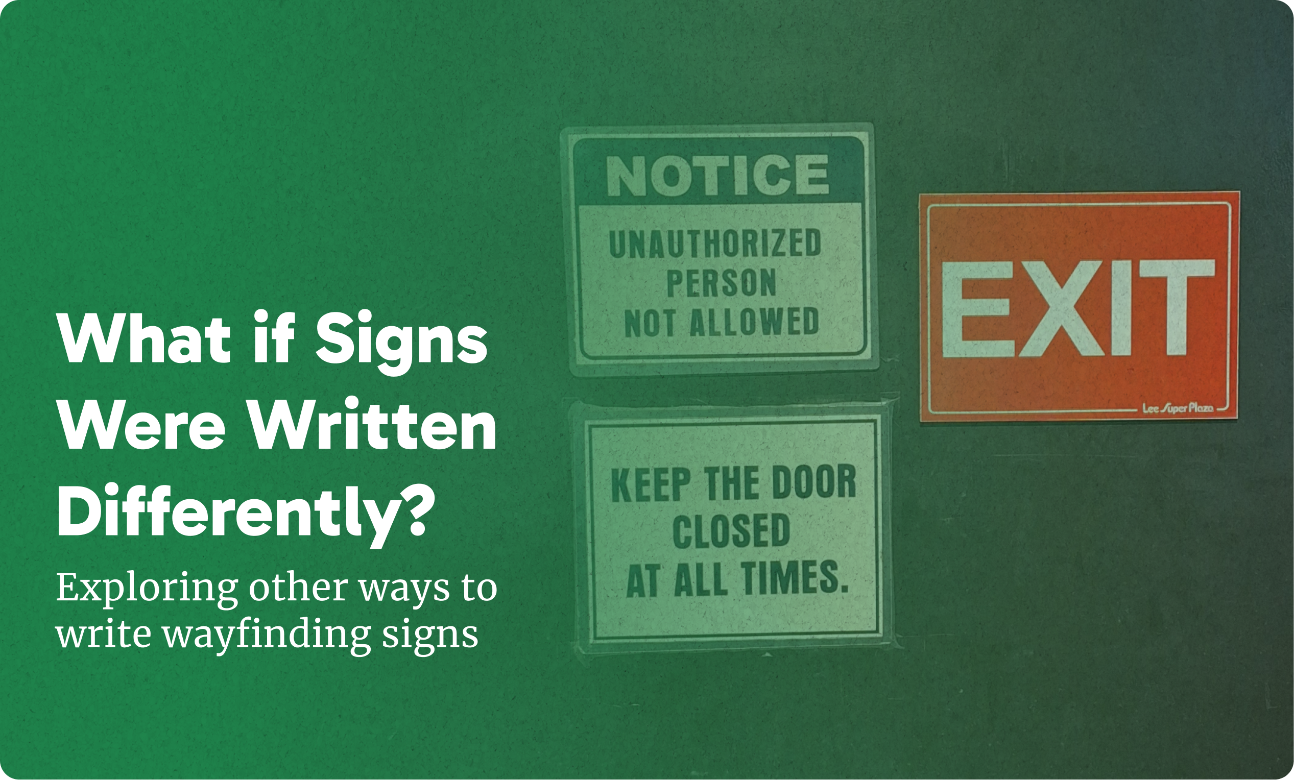
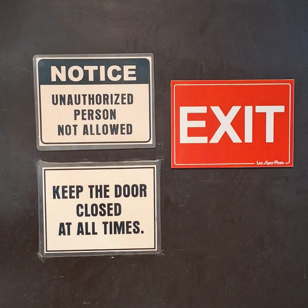
Some signs caught my attention lately—3 signs, specifically.
Having worked as a content writer for years, I’ve become sensitive to the way words are written in public. It’s the same sensitivity a dog has when it hears the word “C-a-r R-i-d-e."
Now that I am also learning more about user experience design, the arrangement of non-literary words has become an area of interest for me, specifically wayfinding signs. Clear writing affects whether someone knows how to operate the airplane door in emergencies or find the exits in fires.
But in the case of the signs that caught my attention, it was more about exploring how else the same message could be conveyed.
“Unauthorized Person Not Allowed”
The first thing that leaped at me was the one on the top left: “Unauthorized person not allowed.” A double negative in the wild.
Why write it this way? From the limited information I could divine, it was important to highlight "unauthorized persons" right from the start. That's fair. Trade secrets or napping quarters hide behind the door, and they are certainly not for unauthorized persons to behold.
But "not allowed"? C'mon. There are shorter words for that. There must be. Shorter words need less mental energy to process.

An approach I thought about was to switch it to "Authorized Persons Only". That's just 3 words. Less syllables. As a bonus, it creates a visually satisfying upside-down triangle shape like Dante's map in Inferno, except with less demons.
“Keep the Door Closed at All Times”
Now what about "Keep the Door Closed at All Times" I appreciate how much of a sentence it sounds like, but the context allows us to bend the rules of grammar a bit. Like, for example, we can tell the article “The” to go home early without losing meaning; there's only *this* door we're talking about, anyway.
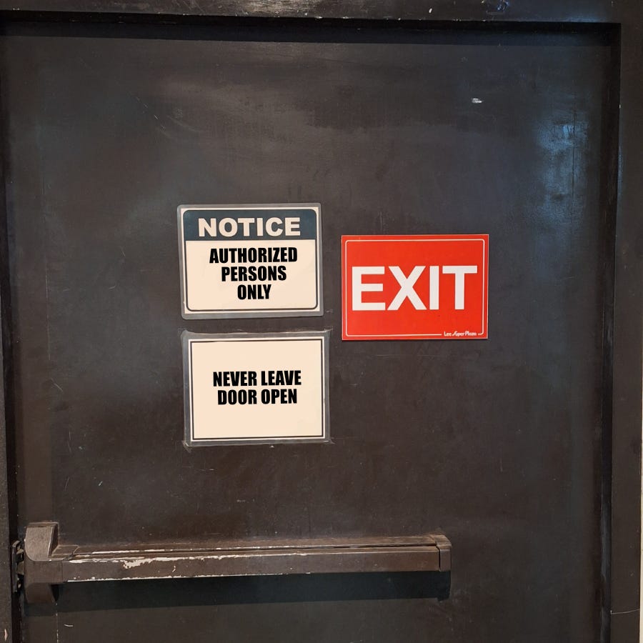
Since I fancy myself to be of a mischievous persuasion, I decided to channel some of the negativity the top sign had to this one. So the "At all times" trident could work as well as a spear: "Never."
Now, I realized why they went with their version. It’s better to use the word “Closed” because it creates the imagery of a blocked pathway rather than an empty hallway, which “Open” might trigger." Fair play, office admin.
“EXIT”
Finally, there is the Exit sign. Cute for the door to wear its job title on its chest like a clerk. The color is loud and the text thick and simple. A direct revision is impossible. So, as the merry prankster that I am, I decided to complicate it.
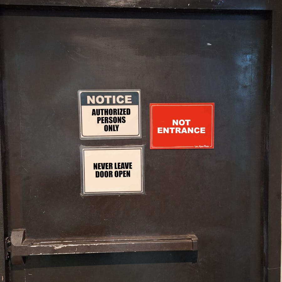
"Not entrance." 2 words. Multisyllabic. Visually smaller to fit the canvas.
In a UX context, they’d probably shoot me for this change. But comedically, I think it’s got potential. Flipped versions always have a fun absurdity to them, like calling airports "plane garages" or pants "leg shirts." Of course, mileage may vary—but it's got legs, baby!
No sign is final
Someone had to think about every sign you’ve come across. That person probably went through this entire process, maybe with less whimsy. Now, those signs are influencing people’s behaviors. They let others know what is and isn’t an exit and where the unauthorized aren’t welcome.
So the next time you see a sign on the road, ask yourself: How else could this have been written?
Always Keep Door Closed is also a good option! but Not Entrance is the best 😆